A bond yield curve is a line graph that plots the yield to maturity of bonds with the same credit quality but different maturity dates, showing how interest rates vary across the term structure. Reading it is mostly a matter of looking left to right along the maturity axis, comparing yields rather than prices, and naming the slope. Ten minutes with a free chart from the U.S. Treasury or FRED is enough to get comfortable.
The yield curve is the market’s most watched forward-looking signal, and it also sets the benchmark that corporate and municipal bonds are priced against. Once you can read it, headlines about inversion and rate cuts stop being noise.
What the curve shows:
- The horizontal axis is maturity, running from one month out to thirty years. Further right means the money is locked up longer.
- The vertical axis is yield to maturity, the annual return if you bought at today’s price and held the bond to maturity.
- The slope is compensation for term. The extra yield investors demand for lending out money for a decade instead of a year.
- Every bond on one curve shares the same credit quality. Mix issuers with different default risk and the chart stops meaning anything.
This guide covers what the curve is, a repeatable five-step reading procedure, what each shape tends to signal, and where the curve runs out of useful answers. Rules and rates here reflect how U.S. markets generally work and change often, so treat everything as education rather than advice about your own portfolio.
Table of Contents
- What Is a Bond Yield Curve?
- Why yields differ across the same curve
- A simple example
- What Does a Normal Yield Curve Tell Investors?
- How to Read a Bond Yield Curve Step by Step
- Step 1: Find a benchmark curve you trust
- Step 2: Identify the maturity buckets on the horizontal axis
- Step 3: Compare yields, not prices
- Step 4: Measure the slope and name the shape
- Step 5: Check the 2s10s spread, then look outside the curve
- What Does an Inverted Yield Curve Mean?
- Why Do Bond Prices and Yields Move in Opposite Directions?
- Which Yield Curve Should U.S. Investors Watch?
- The 3-month versus 10-year spread
- The 2-year versus 10-year spread
- The 5-year versus 30-year spread
- What Can a Yield Curve Not Tell You?
- Frequently Asked Questions
- How can I understand bond yield curves?
- What does 12% YTM mean?
- How do I interpret bond yields?
- What does a good yield curve look like?
- Where can I see a free yield curve chart?
- Should I buy short-term or long-term bonds when the curve is steep?
- Conclusion
What Is a Bond Yield Curve?
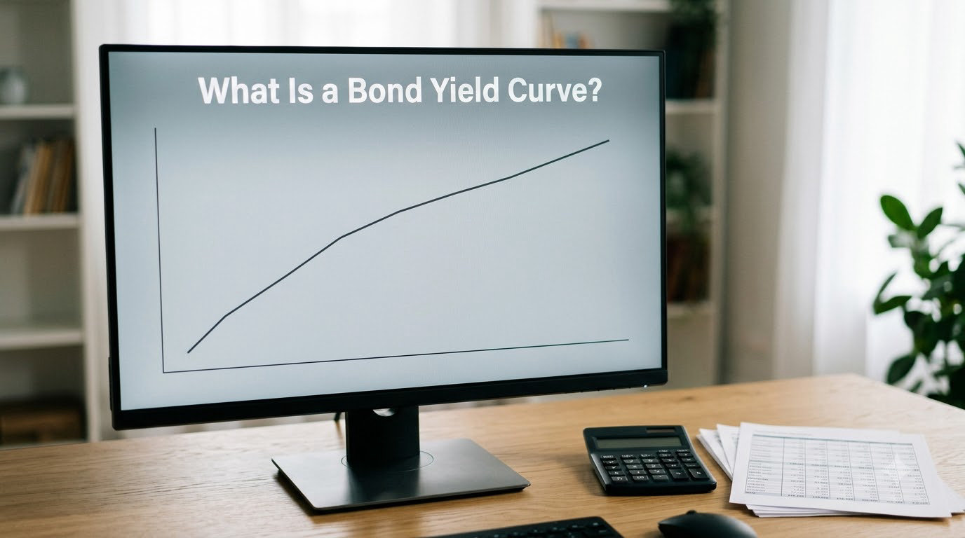
A yield curve puts yields on one axis and maturities on the other, then plots only securities that are directly comparable. The standard version uses U.S. Treasury securities, from Treasury bills out to the 30-year bond, because those are treated as free of default risk.
That last point is the whole reason the curve is built the way it is. If you plotted a Treasury yield next to a subprime corporate yield on the same line, the gap would mostly reflect credit risk rather than time, and you would be reading two different things at once.
Why yields differ across the same curve
Two forces do most of the work. Expectations theory says investors demand more yield on longer bonds because they expect inflation to be higher later, or because they expect short-term rates to rise. Term premium adds a second layer: locking money away for thirty years carries uncertainty that nobody can price precisely, so investors ask for compensation on top of expected inflation.
When short rates are low and long rates are high, both forces push the curve upward. That upward slope is the normal state and has been the most common shape for most of the last four decades.
A simple example
Imagine a fictional set of same-day Treasury yields: 1-year at 3.20%, 5-year at 3.85%, 30-year at 4.40%. Plotted together, those three points make an upward-sloping curve. The 30-year pays 120 basis points more than the 1-year, which is roughly 1.2 percentage points of extra annual yield for tying up the money for three decades.
Now compare that to a single bond. One 5-year note bought at par with a 3.85% coupon has a yield to maturity of 3.85% and its own maturity date. That is a yield curve with one point on it, which tells you almost nothing about the term structure. The curve only becomes informative when you compare several maturities side by side.
What Does a Normal Yield Curve Tell Investors?
A normal yield curve slopes upward: short-term yields are lower than long-term yields. Investors generally read that as a market expecting the economy to keep growing and inflation to stay contained, with the Federal Reserve able to hold or ease short-term rates without creating an inflation problem.
Long maturities usually pay more for three specific reasons:
- Expected inflation erodes what a fixed coupon is worth, and longer bonds carry more of that expectation.
- Policy uncertainty means nobody knows where the federal funds rate sits five or thirty years out, so long bonds demand a margin.
- Rate risk is real for long bonds. A 30-year is far more sensitive to a quarter-point change than a 1-year is.
When the curve flattens, the short end catches up with the long end. That usually means the market has priced out near-term rate cuts and expects policy to hold higher for longer. When it inverts, the short end goes above the long end and the market is effectively betting that rates will fall from here.
| Shape | What the slope looks like | How to read it | What it tends to signal | Typical economic context |
|---|---|---|---|---|
| Normal (upward sloping) | Long yields above short yields | Term premium plus expected growth | Growth and inflation expected to persist | Mid-expansion, policy tightening phase |
| Steep | Long yields far above short yields | A large gap between the two ends | Strong recovery hopes or heavy future easing expected | Early expansion, or right after cuts begin |
| Flat or humped | Yields nearly equal, sometimes a bulge in the middle | Rising short rates meeting static long rates | Policy holding tight; growth concerns appearing | Late cycle, near the point of inversion |
| Inverted | Short yields above long yields | The market expects rates to fall | Slower growth or a higher chance of recession | Late cycle, often before a slowdown |
A steep curve deserves separate attention. A big gap between the 2-year and the 30-year often shows up when the Federal Reserve has just started cutting after holding rates high, because short yields fall faster than long ones. Long-run investors sometimes read that steepness as the best buying window in years, since new long bonds lock in more yield than the short end offers.
How to Read a Bond Yield Curve Step by Step
This is the procedure I use, and it takes about five minutes once you know where to look.
Step 1: Find a benchmark curve you trust
Go to the U.S. Treasury’s daily yield curve page, which publishes par yield curve rates for every published maturity each business day, or to FRED, the Federal Reserve’s economic data service, where the 10-year minus 2-year spread has a series you can pull up in seconds. Both are free and neither requires an account. Brokerage platforms and charting tools like TradingView draw the same data with more decoration, which is fine once you know what you are looking at.
Step 2: Identify the maturity buckets on the horizontal axis
Confirm that the axis runs from bills on the left to the 30-year on the right. Charts get rearranged constantly, and a curve with the axes flipped looks like a total inversion when nothing has changed. Check the labels before you check the slope.
Step 3: Compare yields, not prices
Read the yield column, not the price column. A 1-year Treasury showing 3.20% and a 30-year showing 4.40% means longer bonds pay more, regardless of what those bonds cost you to buy. Prices move for a different reason entirely, and mixing the two is the most common beginner mistake.
Step 4: Measure the slope and name the shape
Subtract the short yield from the long yield and express the result in basis points. One hundred basis points equals one percentage point, so a 3.20% 1-year against a 4.40% 30-year is a spread of 120 basis points, which reads as a normal, moderately steep curve. Then match it against the table above and say the shape out loud, because naming it forces you to commit to an interpretation.
Step 5: Check the 2s10s spread, then look outside the curve
The 2s10s spread is the 10-year yield minus the 2-year yield, and a negative reading is the market’s most-cited inversion number. FRED publishes it directly. After that, pair the curve with other signals: the unemployment trend, payroll growth, inflation prints, and the market’s expectations for the federal funds rate. No single line tells you what is coming, and the curve works best as one input among several.
What Does an Inverted Yield Curve Mean?
An inverted yield curve is one where short-term yields sit above long-term yields, so the line slopes downward from left to right. In plain terms, the market is paying less for thirty-year money than for one-year money, which only makes sense if investors expect policy rates and short-term borrowing costs to fall.
The standard example: a 2-year yield at 4.50% and a 10-year yield at 4.10%. The 2s10s spread is minus 40 basis points. That is a negative reading on the most widely followed recession indicator, and it has preceded most U.S. recessions since the Federal Reserve began publishing the data in the 1970s.
Why would the long end be lower? When the central bank is near the top of its rate cycle, short-term yields reflect today’s policy rate, which is high. Long yields reflect inflation expected a decade from now, which nobody expects to be high in the same way. When expectations for the short end fall, short yields drop faster and the curve flips.
Here is where honesty matters. Inversion is a probability signal, not a schedule. Some inversions have been followed by slow growth without a recession, several have been followed by a recession within a year, and a few have unwound before anything happened at all. Treat it as one reason to slow down and check your assumptions, not as a reason to panic out of the market on a particular day.
Why Do Bond Prices and Yields Move in Opposite Directions?
Bond prices and yields pull in opposite directions because of what a fixed coupon pays you. A 30-year note paying 4.40% is attractive when comparable new debt pays 5%. If rates rise to 5%, that fixed 4.40% looks thin, so buyers bid the price down until its yield to maturity reaches the new market level.
The math is straightforward. Buy a 10-year Treasury at 100 with a 4.40% coupon. If yields climb to 5%, the same bond falls to roughly 91, a 9% decline on the purchase price. Push yields down to 3.80% and it rises to about 107. Long bonds move a lot more than short ones, which is why duration is the risk number bond fund fact sheets print first.
A falling yield is not automatically a better investment. When yields drop, prices rise, and the bond you already hold has just gained value. But every coupon payment that comes after the yield decline gets replaced by a reinvestment at the lower rate, and that reinvestment risk is real over a long retirement. Short bonds have less of both problems, which is why duration is a genuine trade-off rather than a free win.
Which Yield Curve Should U.S. Investors Watch?
There is no single correct curve, because each maturity pair answers a different question. The most useful habit is stating the exact comparison out loud whenever you read or repeat a headline about the curve.
The 3-month versus 10-year spread
This is the broadest and most sensitive measure. The 3-month bill tracks the federal funds rate almost exactly, so it moves with actual policy, while the 10-year reflects expectations. A negative reading on this pair has historically been the most reliable recession signal of the three.
The 2-year versus 10-year spread
This is the 2s10s, the number quoted on the news and published by FRED. The 2-year sits between bills and long bonds, so it blends policy expectations with the growth outlook. It usually gives up earlier than the 3-month pair and is more responsive to changes in expected policy over the next year or two.
The 5-year versus 30-year spread
Both ends here sit far from the policy rate, so this pair is mostly a read on long-run inflation and the term premium. It rarely inverts, which is exactly why an inversion here is unusual and tends to get attention when it happens.
For an individual building anything laddered, the maturities on the curve matter as much as the shape. If you plan to need cash in three years, the 3-year point is your real rate, and the rest of the curve is context.
What Can a Yield Curve Not Tell You?
The curve is a market price, not a forecast. It prices what participants expect and hedge, and those are different things from what will actually happen.
- It says nothing precise about timing. An inversion tells you the odds of a slowdown rose. It does not tell you the month it starts.
- Policy shocks move it fast. A surprise rate decision or an inflation surprise can invert or steepen the curve without any change in the real economy.
- Government debt supply shifts long rates independently. Heavy issuance can push the long end up regardless of what the short end is doing.
- Global demand for Treasuries moves yields too. Foreign buying and currency hedging costs can lift or lower long yields independently of U.S. policy.
- Corporate and municipal curves carry credit spreads. The gap between a corporate bond and a Treasury of the same maturity measures default and liquidity risk, not the term structure. Spreads widen during stress, which moves the corporate curve for reasons the Treasury curve does not reflect.
- Correlation is not causation. Inversion and recessions travel together often, but plenty of growth happens after an inverted curve, and plenty of recessions begin without one.
Treasury yields are also quoted as par yields, the yields on newly issued bonds priced at face value, not the yields of bonds already trading in the market. For most reading purposes the difference is small. Spot rates and forward curves go further into detail; a forward curve starts from today’s spot curve and embeds the market’s expectations about future rates, and it is genuinely useful but belongs in a later conversation.
Frequently Asked Questions
How can I understand bond yield curves?
Start by remembering the curve compares bonds that are identical except for maturity. The horizontal axis shows how long each bond has left to mature, and the vertical axis shows its yield to maturity. Look at the slope: rising means longer bonds pay more, flat means short and long yields are close, falling means short bonds pay more. Name the shape, then ask what it implies about expected growth, inflation and policy. That single habit covers most of what professionals look at.
What does 12% YTM mean?
A 12% yield to maturity means the annual return you would earn if you bought the bond at today’s price and held it to maturity, assuming it pays on time. On a bond bought at face value with a 12% coupon, the coupon rate and the yield are the same number. On a bond bought below face value, the yield to maturity runs above the coupon because you collect par at maturity. A 12% yield is high for a Treasury and usually signals either a long maturity, a lower credit quality issuer, or both.
How do I interpret bond yields?
Compare yields at the short and long ends, convert the gap into basis points, and match the result to a named shape. A positive gap reads as normal or steep, a near-zero gap as flat, and a negative gap as inverted. Then check which maturities you compared, because a 3-month and 10-year pair can invert while a 5-year and 30-year pair stays positive. Read the same data on a curve with one consistent credit quality and interpret it alongside inflation and employment trends.
What does a good yield curve look like?
There is no good or bad shape. The shape reflects where the economy sits in its cycle rather than the quality of any investment, and the same inverted curve has preceded both recessions and long slow expansions. What matters for you is whether the curve matches the time horizon you need. A saver building a two-year ladder cares more about the 1-year and 2-year points than anything happening at 30 years.
Where can I see a free yield curve chart?
The U.S. Treasury publishes daily par yield curve rates for every published maturity on its website at no cost. FRED, run by the Federal Reserve, hosts the 10-year minus 2-year spread and dozens of other rate series you can pull up by series code. Brokerage platforms and charting tools like TradingView also draw Treasury curves live. The Treasury and FRED pages are the cleaner starting points because they show the data without extra overlays.
Should I buy short-term or long-term bonds when the curve is steep?
A steep curve offers more yield on the long end than the short end, which is why some investors extend duration in that environment to lock in more income. It is a reasonable read on relative value, not a guarantee. Long bonds also carry more rate risk, so if rates rise rather than fall, the extra yield you locked in gets offset by a lower price. Match the maturity to when you actually need the money, and decide how much price movement you can tolerate.
Conclusion
Start by naming the exact maturities you are comparing, because a yield curve is meaningless without its labels. Then read the slope, convert the gap between the short and long end into basis points, and give the shape a name. Finally, interpret that shape alongside growth, inflation and Federal Reserve expectations rather than treating it as a forecast you can trade on. That loop takes five minutes a week, and it is the whole skill. Rates and definitions shift as policy changes, so this is general education, not individual investment advice.