
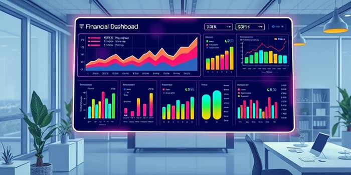
In an era where data is the lifeblood of decision-making, managing your finances effectively has never been more crucial. Whether you are an individual striving to grow personal wealth, a startup racing against burn rate, or an established enterprise coordinating budgets across departments, a well-crafted financial dashboard provides clarity and confidence. By consolidating disparate data streams into a centralized, intuitive interface, you eliminate the noise and focus on what truly matters. This guide will walk you through creating a dashboard that delivers at-a-glance insights into key metrics and transforms raw numbers into strategic actions.
Introduction to Financial Dashboards
Financial dashboards are interactive business intelligence tools designed to visualize critical performance indicators such as revenue, expenses, assets, liabilities, and equity. They leverage charts, tables, and scorecards to transform complex datasets into digestible visual narratives. Unlike static reports, dashboards update automatically, ensuring that stakeholders always base decisions on the latest information. With customization options and drill-down capabilities, you can cater views to specific roles—executives, finance teams, sales managers, and more—each gaining the insights they need.
By implementing progressive disclosure with drill-down capabilities, dashboards balance simplicity and depth. Users begin with high-level summaries and then explore detailed data for anomalies or trends. This design philosophy minimizes overload for non-finance audiences while retaining granular controls for analysts. Ultimately, dashboards act as command centers, enabling both strategic planning and tactical adjustments with equal ease.
Benefits of Real-Time Financial Tracking
One of the most powerful advantages of a financial dashboard is real-time monitoring of cash inflows/outflows, which helps you anticipate liquidity issues before they materialize. Automated tracking of overdue invoices and upcoming bills keeps collections and payments on schedule, reducing carrying costs and late fees. Beyond basic cash management, dashboards enable granular profit and loss breakdowns by client, project, or product line, revealing high-performers and units requiring cost controls.
Real-time visuals also uncover emerging trends, allowing proactive adjustments to pricing, staffing, or investment strategies. Collaborative features ensure team members and external stakeholders can comment on insights, fostering alignment and accountability. When forecasting scenarios based on live data, you gain a competitive edge, adapting swiftly to market shifts and internal performance changes. This level of responsiveness is critical in uncertain economic climates.
Essential Components and KPIs
A robust dashboard spans multiple financial dimensions. Here are the core categories, associated KPIs, and illustrative visual elements that bring each section to life:
Each section plays a vital role: cash flow visuals provide runway estimates for startups, while P&L breakdowns reveal margin drivers in professional services. Revenue vs. expense comparisons guide budgeting and forecasting, and progress modules track milestones for personal or corporate goals. When integrated seamlessly, these components form a holistic financial ecosystem.
Design Best Practices
Effective dashboards adhere to a set of design principles that emphasize clarity, consistency, and accessibility. Position your most critical KPI, like cash runway, at the top to satisfy the five-second rule. Group related metrics visually and use white space to separate sections, preventing cognitive overload. Maintaining multi-device responsive and accessible design ensures stakeholders can review dashboards on desktops, tablets, or smartphones without loss of function or fidelity.
- Restrict visuals to 5–9 elements per view and avoid clutter with drill-down options.
- Use a unified color palette and typography for brand consistency.
- Apply colorblind-friendly gradients and standard numeric formats.
- Label data clearly and describe sources to build trust with users.
Advanced tips include embedding contextual annotations to explain anomalies, incorporating customizable legends, and enabling automatic data refresh and annotations to maintain accuracy. By balancing simplicity with depth, you empower both novice and expert users.
Building Your Dashboard Step-by-Step
Follow this structured approach to create a dashboard tailored to your strategic objectives and audience needs:
- Define your goals: Identify key business questions and align metrics to outcomes, using frameworks like the Balanced Scorecard’s financial perspective.
- Select data sources: Consolidate inputs from accounting systems, CRMs, and spreadsheets. Automate connections to eliminate manual data entry.
- Prepare your data: Normalize and structure tables for revenue, expenses, and balance sheet items over consistent time frames.
- Choose visualizations: Match chart types to data—lines for trends, bars for comparisons, pies for composition.
- Implement interactivity: Add filters, hover tooltips, and drill-down paths to let users explore details on demand.
- Iterate and refine: Gather user feedback regularly, update KPIs as goals evolve, and test performance on different devices.
This methodical process reduces development time, minimizes rework, and ensures your dashboard remains aligned with evolving business needs.
Tools and Templates
A wide array of tools and ready-made templates streamline the creation of financial dashboards. Your choice should reflect the complexity of your data, collaboration requirements, and technical skill level.
- Excel: Ideal for personal and small-business use, offering pie, bar, and area charts with formula-driven data models.
- Coupler.io, Jirav: Automate data imports from multiple platforms and build P&L or overdue invoice trackers with minimal scripting.
- Kubera: Specializes in multi-currency net worth tracking, IRR calculations, and portfolio analytics.
- Qlik Sense, Power BI: Enterprise-grade solutions providing advanced analytics, narrative automation, and global formatting.
- Notion: Combines simple budget trackers and goal dashboards with collaborative editing for teams.
When selecting a platform, consider factors like data volume, integration capabilities, user collaboration, and customizability. Starting with a template can accelerate deployment, allowing you to focus on refining insights rather than building from scratch.
Real-World Use Cases
Financial dashboards bring value across industries and scenarios. For startups, a live cash runway chart and burn rate indicator guide fundraising strategies and operational cutbacks. Professional services firms track billable hours by client to optimize resource allocation and improve margins. Individuals maintain personal finance dashboards, updating income and expenses in under five minutes weekly to monitor net worth and set savings targets. Corporate finance teams analyze actual versus forecast expenses monthly, adjusting budgets and cost centers in real time. Investors leverage dashboards to compare portfolio performance in stocks, crypto, and real estate against benchmarks, enabling strategic rebalancing and tax planning.
By following these guidelines for KPI selection, design, and maintenance, you can build a financial dashboard that not only informs but inspires confidence and drives better decisions. Embrace this tool to transform raw data into a clear, actionable story, guiding you toward your financial goals with precision and speed.
References
- https://blog.coupler.io/financial-dashboards/
- https://www.lucid.now/blog/ultimate-guide-to-financial-dashboards-for-startups/
- https://www.youtube.com/watch?v=GF3jvNUMWB8
- https://www.hubifi.com/blog/financial-kpi-dashboard-guide
- https://www.kubera.com/blog/financial-dashboard
- https://corporatefinanceinstitute.com/resources/fpa/financial-dashboards-that-drive-decisions/
- https://www.qlik.com/us/dashboard-examples/financial-dashboards
- https://www.has-team.com/blog/building-an-effective-financial-dashboard-for-decision-making
- https://breakyourbudget.com/personal-finance-dashboard
- https://www.fusioncharts.com/blog/10-tips-for-making-a-good-financial-dashboard-even-better/
- https://www.clearpointstrategy.com/blog/financial-dashboard
- https://www.jirav.com/blog/best-practices-for-maintaining-a-financial-dashboard
- https://www.notion.com/templates/personal-finance-dashboard-tracker
- https://www.rib-software.com/en/blogs/bi-dashboard-design-principles-best-practices
- https://www.youtube.com/watch?v=2YUh0gjverA